


Domy Books
Austin, Texas
January 14 - March 1, 2012
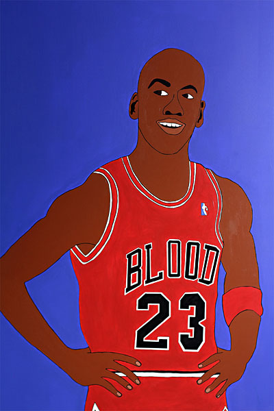
The work of Joshua Saunders often begins from a contradiction. It foregrounds elements that prove incendiary within the threadbare discourses of race, sex, gender, and violence. But this foregrounding is backed by the artist’s intense desire to get them out of the way. He does not want to talk about them. Asked whether or not his work has a place in these conversations, he is evasive. “The work is (about) humor.” This complicated stance exposes the train of concerns the viewer brings on her own. What makes her laugh? What makes her angry? What does and does not make sense to her modes of perception? One does not look at Saunders’ work but reaches around it, back at herself, clasping her own hand. In doing so, she’s surprised to find herself embracing, in this particular show, a cripped out puppy or a steamrolled Michael Jordan.
Crip/Blood is no less punchy than anything the artist has done before, but it is perhaps his most concentrated meditation thus far. This concentration accesses a distinction not thought about enough: what is the difference between a community and a mass? How does what started in Compton in ’69 amongst a definable, interrelated, if highly conflictive, group become currency for a heterogeneous zoo of characters—from rich white boys to barrio youth—who happen to drink from the same mass media watering holes? What is it that they all find sustaining and seductive? Who produces who?
In responding to these questions, the artist relentlessly obliterates and reinscribes a battery of oppositional pairings, all the while irreverent of any difference between the formal and the social: red/blue, black/white, black/black, East Coast/West Coast, playground/street, hard/soft, uncouth/genteel, isolated/disseminated, and of course, Crip/Blood. This final pair is currently one of the mass’s fullest and emptiest signifiers, the artist seems to be saying. They are no longer even words, but icons. Crip and Blood are no longer text, but image—one amidst a myriad reflected in the surfaces of our respective watering holes.
Slurp slurp Slurpee.
Josh T Franco
Austinist Interview (More about the Slurpee machine…)
Austin Chronicle review by Andy Campbell
Franco
Image: Joshua Saunders, Michael Jordan, 2011
Co-Lab Projects
Austin, Texas
A Fusebox Festival Featured Project
April 1 - April 12, 2014
Joshua Saunders shows new work (collages, sculpture, images). Josh T Franco often writes his artist statements (an Austin art worlds secret no one cares about). The process begins when Joshua sends Josh a rambling email with images and some punctuation. Josh writes back with flourish and craftiness. This new work starts from found flashcards (shit, did he just tell a secret?). It is terrifying to respond to vocabulary cards with more word [sic]. So I am done. In flashcard spirit, the following (and title) are sampled from Joshua’s rambling email. (Is Josh lazy or just feeling blue?) Read these. See the show.
3 – 6 of these
40 x 60 ish
confusing object to image relationship
perfect / content-less / same time
blue implications
human emotional experience
question intent
upscaled / less benign / more cunning
who the fuck took these pictures
all my love.
Art History Department (Selected works from the Handwerker Gallery)
Ithaca College, Ithaca, NY
Spring 2014
The sixties were graphic. Images from that decade persist: bare bodies, ecstatic gestures, violence waged through a gamut of political struggles. The graphic nature of the televised Vietnam War and the spectacles of social turmoil throughout the country and the world determine much of our collective visual memory of those years.
The sixties were graphic in other ways we might want to recall. Space, particularly sculptural space, was radically re-worked often according to graphs and diagrams from which artists extrapolated a new three-dimensional vocabulary in both conventional and novel industrial materials. In place of Brancusi’s soaring birds and Picasso’s eclectic figures, artists like Arthur Hoener reconsidered the stakes of the objects placed on pedestals in art contexts (eventually the pedestal disappears entirely). The result is the rectilinear wooden piece before you, in which the grid is subtly riffed on via a gentle wave at the work’s front center.
Responding, often explicitly, to the “overall” action painting—canonized as Abstract Expressionism—of the preceding generation, artists vehemently graphed the two-dimensional plane as well. Here are two examples by Nicholas Krushenick and Frank Stella. From our contemporary positions, we can wonder whether or not these well planned—as opposed to the expressively “intuitive” work of Jackson Pollock or Joan Mitchell—actually don’t express quite a bit. The clear lines, repetitive shapes, and bold colors (in Krushenick) do not seem to be as cold or distant for today’s viewers as many critics of the sixties tended to characterize them. Why does their resonance persist?
Somewhere between the two-dimensional face of paper and the tactility of sculptural objects lies the book. Produced by Pace Gallery in a limited edition print of 100, Lucas Samaras’s lush—graphically so—creation is rife with serial tropes and surreal pagescapes accompanied with lyrical, obscure texts that push the reader/viewer’s enactment of conventions for engaging with artworks and books to a dizzying limit. A fun limit, if you don’t fight it.
Undated, but assumedly preceding the sixties, the lithograph by Alexander Calder presides over this small, but bold crew. The shared features of this artwork—hidden away in the Handwerker Gallery’s curious stores—with those of the younger artists present witnesses to the notion that perhaps the sixties were not so radical a rupture as they are often framed. No conclusions can be made from such a limited, if vivid, sampling, but at least it raises the question. How much more graphic were the sixties, really, than Calder’s time? Than our own?
Josh T Franco
Image: Lucas Samaras, A Book/Object, 1968, illustrated book with eleven die-cut screen prints with collage additions
Do Right Hall
Marfa, Texas
March 2013
For his first show in Marfa, Joshua Saunders makes a pantheon of the little white church-cum-gallery known as the Do Right Hall. Lurid portraits against nostalgia are composed from treasures in the artist’s surround. But the surround is emptied out, and what results are images ofgods: of Worn Shoes, Beaten Dolls, Dead Birds, and Las Vegas. Laser-focused in content, expansive in scale, the artist has carpentered portals from photographs.
The vast cosmos ruled by each god is signaled in the indulgent black in which they hover. A Substantial Black. A Black Worth Seeing. Whether the high beings vibrate into or away from the viewer changes with each portrait, and is perhaps affected by her amount of faith. Faith in what? No single word suffices, but safe to say, it is the same faith with which an artist known for unyielding collage and an aggressive ocular volume leapt backward into darkness and brought back the singular deities the world would otherwise toss out. Perfect again, the Marfa setting, for its Mecca-type status to some. Here’s praying safety on your pilgrimage. May Saunders smile on your journey.
Josh T Franco
Video: Joshua Saunders, OBJECTIFICATION, Big Medium, Austin, Texas July 2011
IMAGE: Charlotte Hallberg, So much time, not even tired, 2016
Opening: June 2, 2016
CRUSH CURATORIAL: Chelsea
“And the students asked me what I was going to do. I said, and stuttered, ‘To open eyes.’ And this became the rule for my life. I have taught to learn to see. In my color book there is no new theory of color. But in it there is a way how to learn to see.”[i]
So recounted Josef Albers in 1968. Charlotte Hallberg, a generation removed, still lives with this teacher’s ghost. Albers’s contributions to the fields of art and graphic design are encapsulated in the publication mentioned above, Interaction of Color.Albers and his students carried out the corresponding experiments in paper, more expedient and consistent in texture than other materials. Hallberg moves the experiments forward in labor-intensive, complete paintings. Albers haunts, Hallberg exorcises. The concise exhibit Short Sight, Soft Touch offers four moments in which the artist, vigilant inheritor of a long line of color theories and this thing called painting, recasts Albers’s layer-and-juxtapose lessons through her own evolving geometry of wave-and-radiate, a muscular psychedelia all her own.
SHORT SIGHT
“Asleep with the lights on again” and “So much time, not even tired,” as their titles hint, speak most directly to Hallberg’s source material: an historically unprecedented oscillation of electronic and “natural” light, electrically illuminated nightscapes, and fulgid handheld tools. Another Albers subheading comes to mind: “color recollection – visual memory.” Hallberg recalls the light of computerized screens: Netflix left running while we fall to sleep; the last semi-conscious Scruff woofs and Tinder swipes at the true end of the waking day; mindless online shopping. These realms of light and color were unknown to Albers, leaving it to Hallberg to pose both their problems and these paintings as answers. The thick concentric bands of color echo the shape of the panel on which they sit and stand in for the deep shallowness of every iPhone screen; the pairs of waved forms laid over this in both paintings,—contoured by thin, Thiebaudesque contrasts—the luminous and spectral trace of oily finger tips sliding down the surface, continuing invisibly beyond.
SOFT TOUCH
Here is the exorcism, the final extraction of Albers’s ghost, the spectacular remnants of which Hallberg has wrought into paintings. Albers’s instruction invites manipulation over and over again by the student, containing moments like the following when regarding its own color plates: “…turn the book so that the left page with the 2 green grids appears above the study with the 2 small dark rectangles at the center.” But these paintings are not a pause in a workshop where we can pick up and rearrange. They are worked out. Hallberg has considered every orientation and placement of these panels and concluded this is how they are best seen. An excellent student, she already asked the questions, finding resolution in fingerwaves and circles, near-flush panels, and this place on the wall.
Albers is certainly not the only ghost here. In their mesmerizing way, Hallberg’s paintings coax long, long looking, so you should have plenty of time to seek out the others.
-- Josh T. Franco
[i] Oral history interview with Josef Albers, 1968 June 22-July 5, Archives of American Art, Smithsonian Institution
Charlotte Hallberg lives and works in Brooklyn, NY. She received her MFA from Yale University, and her BFA from Rhode Island School of Design. She was an Annenberg Visual Arts Fellow from 2010-2012, and has recently shown her work at Tiger Strikes Asteroid, Trestle Projects, and the Parlour Bushwick. This is her first solo exhibition in New York.
Josh T Franco is the Latino Collections Specialist, Archives of American Art, at the Smithsonian Institution.